肥前吉田焼きデザインコンペ受賞製品:肥前吉田産地による陶器製品
課題とチャレンジ
磁器素材を用いた商品化前提のコンペティションにおいて、単なる造形提案にとどまらず、誰もが日常で使いやすい汎用性の高いプレートシリーズを提案すること。
思考とアプローチ
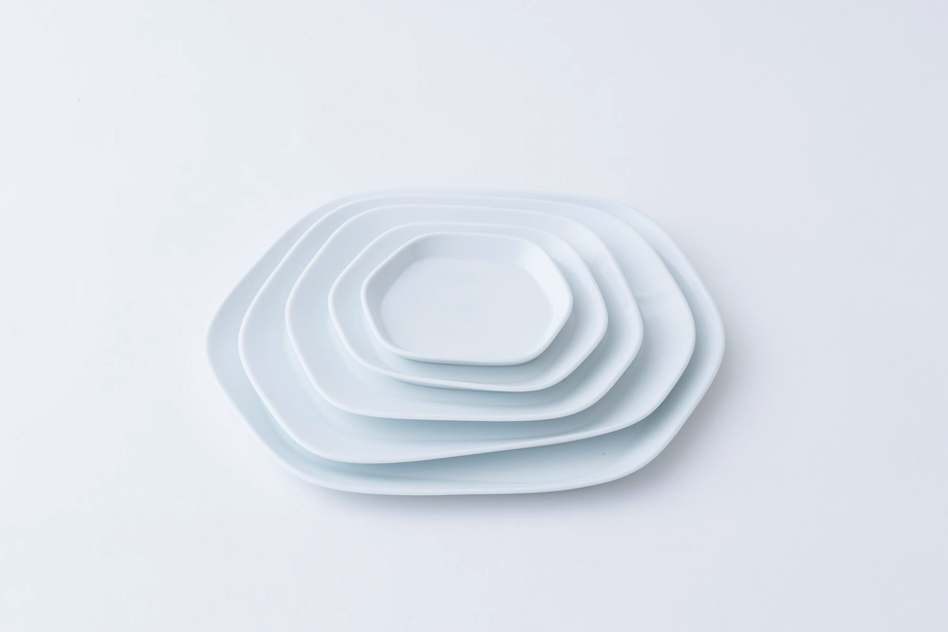
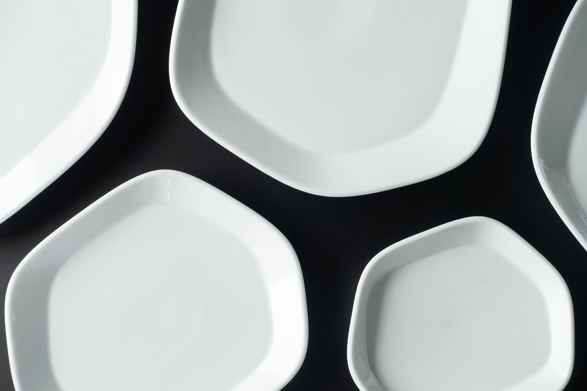
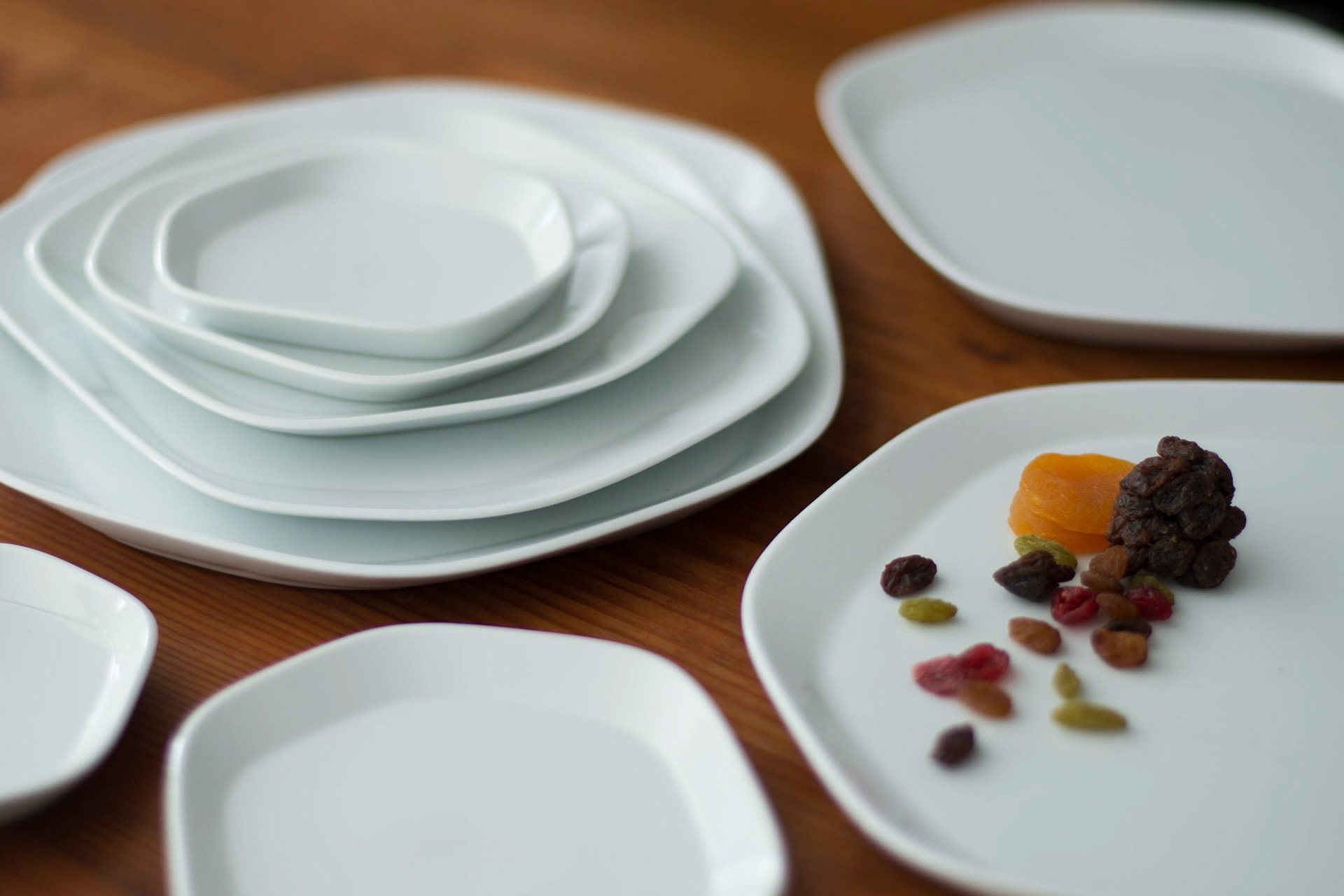
小皿料理がテーブル上にランダムに並ぶ日常の食卓シーンに着目。自然界の構造に由来する「ボロノイ図」の幾何学ロジックを取り入れ、大小のお皿をどこにどう配置しても空間全体として美しく調和する、自由度の高いプレート形状を設計した。
解決策
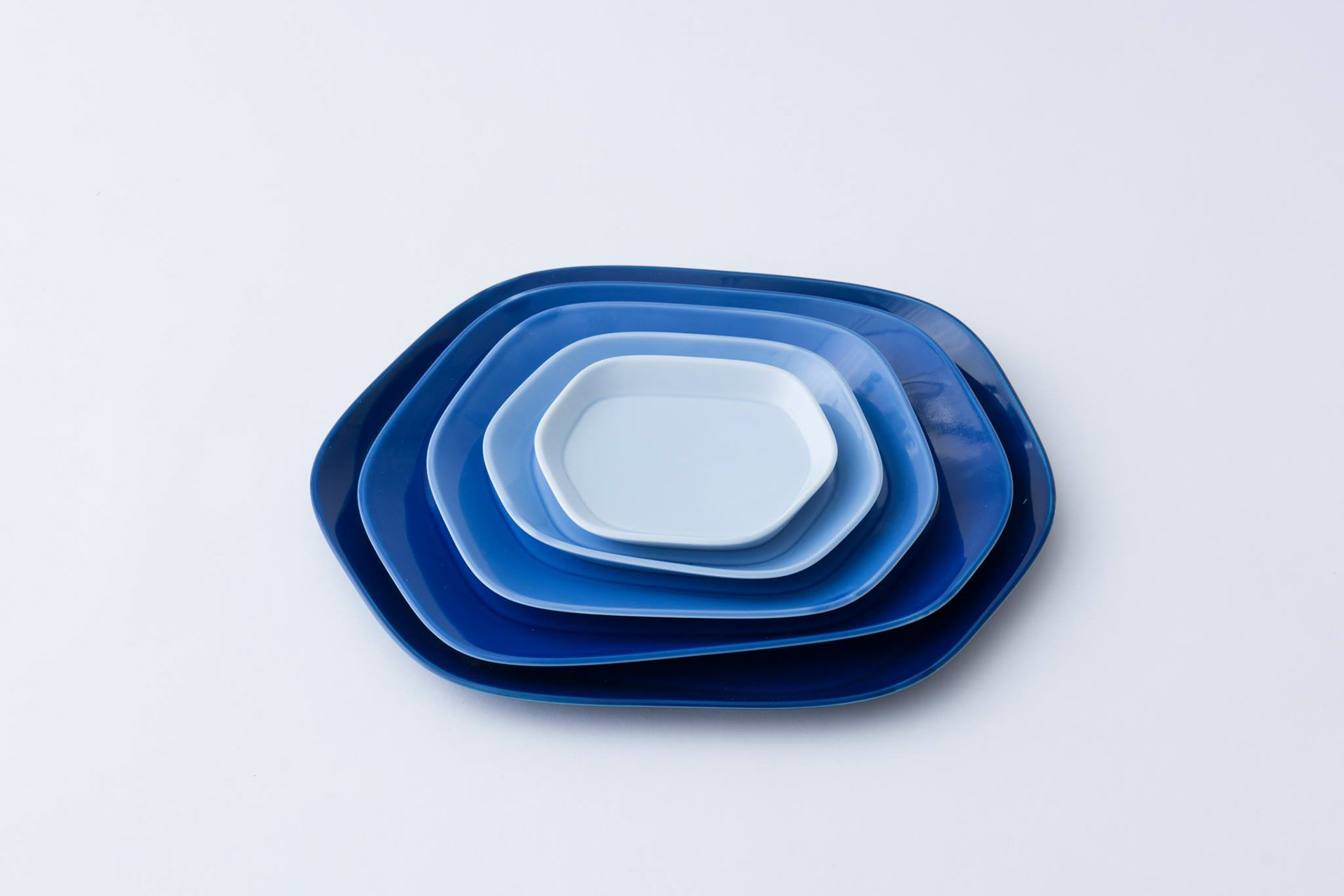
肥前吉田焼の強みである「工業製品としての量産性と、手仕事による小ロット対応力」という商業磁器の産地特性を活用。無理のないディテールと高い再現性を両立した造形を追求した。さらに、地域のアイデンティティでもある「青」のグラデーションカラーを採用し、多様な食卓を彩るデザインへと落とし込んだ。
成果とインパクト
新宿伊勢丹での発表後、プレートの汎用性の高さを活かしてカラーバリエーションを拡充。一般市場にとどまらず飲食店向けの製品展開・販売へと幅を広げ、ビジネス的な展開力を持つラインナップへと成長している。
Challenge
For a design competition focused on commercializing porcelain, the objective was to move beyond mere aesthetic proposals and create a highly versatile, user-friendly plate series for everyday use.
Process
We focused on the everyday dining scene where small dishes are arranged randomly across the table. By incorporating the geometric logic of the "Voronoi pattern" found in nature, we designed a highly adaptable plate shape. This ensures that no matter how plates of various sizes are positioned, the overall tablescape harmonizes beautifully.
Solution
We leveraged the regional characteristics of Hizen Yoshida porcelain—specifically its unique ability to combine industrial mass-production with small-batch manual craftsmanship. We pursued a design that achieves both practical, refined detailing and high reproducibility. Furthermore, we applied a beautiful blue gradient, a color iconic to the region, creating a product that vibrantly enhances diverse dining environments.
Impact
Following its debut at Isetan Shinjuku, we expanded the color variations, capitalizing on the plates' exceptional versatility. The series has since broadened its reach beyond the general consumer market to include B2B sales for restaurants, growing into a highly scalable lineup with strong business potential.
For a design competition focused on commercializing porcelain, the objective was to move beyond mere aesthetic proposals and create a highly versatile, user-friendly plate series for everyday use.
Process
We focused on the everyday dining scene where small dishes are arranged randomly across the table. By incorporating the geometric logic of the "Voronoi pattern" found in nature, we designed a highly adaptable plate shape. This ensures that no matter how plates of various sizes are positioned, the overall tablescape harmonizes beautifully.
Solution
We leveraged the regional characteristics of Hizen Yoshida porcelain—specifically its unique ability to combine industrial mass-production with small-batch manual craftsmanship. We pursued a design that achieves both practical, refined detailing and high reproducibility. Furthermore, we applied a beautiful blue gradient, a color iconic to the region, creating a product that vibrantly enhances diverse dining environments.
Impact
Following its debut at Isetan Shinjuku, we expanded the color variations, capitalizing on the plates' exceptional versatility. The series has since broadened its reach beyond the general consumer market to include B2B sales for restaurants, growing into a highly scalable lineup with strong business potential.